Customizing Visual Appearance
Need a different look and feel? Customizing the visual appearance of Annotorious is easy. All elements of the annotation layer and the editor popup can be styled with CSS.
Customizing Shape Styles
Annotorious renders annotations using SVG. You can completely alter the visual appearance of every graphical element via CSS.
To make styling more flexible, Annotorious adds a few extras:
- For every annotation shape, Annotorious renders two SVG shapes, exactly on top of each other. The two shapes
have different CSS classes -
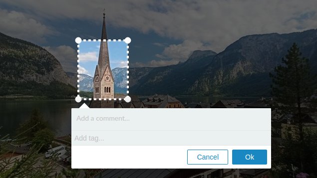
a9s-inneranda9s-outer. You can use this to create line styles with an outline. (The default style renders an outer black line and a slightly thinner white inner line.) - When the user creates a new selection, Annotorious renders a mask element. In the default theme, the mask is hidden. But you can enable it via CSS to add a dimming effect to the area outside the selection.
Custom Style Example

This example applies custom CSS rules to enable the dim mask and give different appearance to the annotation outlines.
/** Hides the outer shapes - for this style we only need one **/
svg.a9s-annotationlayer .a9s-selection .a9s-outer,
svg.a9s-annotationlayer .a9s-annotation .a9s-outer {
  display:none;
}

svg.a9s-annotationlayer .a9s-handle .a9s-handle-outer {
  display:none;
}

/** New style for the annotation outlines **/
svg.a9s-annotationlayer .a9s-selection .a9s-inner,
svg.a9s-annotationlayer .a9s-annotation .a9s-inner  {
  stroke-width:4;
  stroke:white;
  stroke-dasharray:5;
}

/** Disable the hover effect from the default stylesheet **/
svg.a9s-annotationlayer .a9s-annotation.editable:hover .a9s-inner {
  fill:transparent;
}

/** Corner handles **/
svg.a9s-annotationlayer .a9s-handle .a9s-handle-inner {
  fill:white;
  stroke:white;
}

/** Enable the dim mask, black with 60% transparency **/
svg.a9s-annotationlayer .a9s-selection-mask {
  fill:rgba(0, 0, 0, 0.6);
}
Customizing the Editor Popup Style
The editor has the following markup structure and CSS classes:
<div class="r6o-editor">
  <div class="r6o-arrow"></div> <!-- renders the up- or downwards arrow -->
  <div class="r6o-editor-inner">
    <!-- a list of editor widgets, each contained in a DIV -->
    <div class="r6o-widget">
      <!-- ... -->
    </div>

    <div class="r6o-footer">
      <button class="r6o-btn left delete-annotation">
        <!-- Trashcan icon -->
      </button>

      <button class="r6o-btn outline">Cancel</button>
      <button class="r6o-btn ">Ok</button>
    </div>
  </div>
</div>
