Writing Your Own Editor Widgets
You can extend the editor with your own widgets. A widget can be:
- an ordinary JavaScript function that takes a set of input arguments and returns a DOM element, which will be inserted into the editor
- a React component conforming to the same interface conventions as the built-in widgets.
Before you start writing your own widgets, you should first familiarize yourself with the the W3C Web Annotation specification, in particular the concepts of annotation bodies and body purposes.
Annotation Bodies
In the terminology of the W3C Web Annotation spec, an annotation consists of multiple bodies - data structures that each represent one “piece” of the annotation. For example, if an annotation consists of one comment and multiple tags, then each is encoded as one body in the data structure.
{
  "@context": "http://www.w3.org/ns/anno.jsonld",
  "id": "#ce0ed291-766b-4763-8e91-90ce1d04e706",
  "type": "Annotation",
  "body": [{
    "type": "TextualBody",
    "value": "This is a comment",
    "purpose": "commenting"
  }, {
    "type": "TextualBody",
    "value": "A Tag",
    "purpose": "tagging"
  }, {
    "type": "TextualBody",
    "value": "Another Tag",
    "purpose": "tagging"
  }],

  ...

}
To specify the body type, the W3C model has a type field, and an extra (optional)
purpose. For example, tags and comments are both of type TextualBody, but with different
purposes - commenting and tagging.
How Bodies Relate to Editor Widgets
The Editor
handles basic general concerns, like positioning of the popup window and managing the editing state.
Otherwise though, it is just a shell for widgets. Widgets implement user interface representations for
particular types of bodies. The built-in
CommentWidget
handles TextualBody nodes with purpose commenting or replying. The built-in
TagWidget
takes care of TextualBody nodes with purpose tagging. Want to support a new type of body? Assign it a
purpose and make a new widget for it!
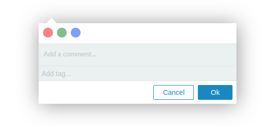
A ‘Hello World’ Widget
As an example, let’s create a minimal editor widget that adds a color selector. Clicking the
selector creates a new annotation body with the purpose highlighting.
var ColorSelectorWidget = function(args) {

  // 1. Find a current color setting in the annotation, if any
  var currentColorBody = args.annotation ?
    args.annotation.bodies.find(function(b) {
      return b.purpose == 'highlighting';
    }) : null;

  // 2. Keep the value in a variable
  var currentColorValue = currentColorBody ? currentColorBody.value : null;

  // 3. Triggers callbacks on user action
  var addTag = function(evt) {
    if (currentColorBody) {
      args.onUpdateBody(currentColorBody, {
        type: 'TextualBody',
        purpose: 'highlighting',
        value: evt.target.dataset.tag
      });
    } else {
      args.onAppendBody({
        type: 'TextualBody',
        purpose: 'highlighting',
        value: evt.target.dataset.tag
      });
    }
  }

  // 4. This part renders the UI elements
  var createButton = function(value) {
    var button = document.createElement('button');

    if (value == currentColorValue)
      button.className = 'selected';

    button.dataset.tag = value;
    button.style.backgroundColor = value;
    button.addEventListener('click', addTag);
    return button;
  }

  var container = document.createElement('div');
  container.className = 'colorselector-widget';

  var button1 = createButton('RED');
  var button2 = createButton('GREEN');
  var button3 = createButton('BLUE');

  container.appendChild(button1);
  container.appendChild(button2);
  container.appendChild(button3);

  return container;
}
Here’s what the code does, explained step by step:
- We grab the first body with
purpose: 'highlighting'from the annotation. - If a body exists, we store the body
valuein thecurrentColorValuevariable. - The
addTagfunction is called whenever the user makes a selection in the widget. (We’ll create the widget later in the code). If the annotation already has ahighlightingbody,addTagupdates this body. If the annotation does not have ahighlightingbody yet,addTagappends a new one. - The remainder of the code renders the user interface elements: 3 identical buttons
in different colors. Clicking a button triggers
addTag. - Just add a bit of CSS for style
Since the highlighting body is now stored in the annotation, we can write a
formatter that renders highlighted
annotations in different colors.
/** A matching formatter that sets the color according to the 'highlighting' body value **/
var ColorFormatter = function(annotation) {
  var highlightBody = annotation.bodies.find(function(b) {
    return b.purpose == 'highlighting';
  });

  if (highlightBody)
    return highlightBody.value;
}
Finally, we add the plugin and formatter to Annotorious on initialization, and apply some CSS for styling.
var anno = Annotorious.init({
  image: 'hallstatt',
  widgets: [
    ColorSelectorWidget,
    'COMMENT',
    'TAG'
  ],
  formatter: ColorFormatter
});
/* 5. CSS styles for the color selector widget */
.colorselector-widget {
  padding:5px;
  border-bottom:1px solid #e5e5e5;
}

.colorselector-widget button {
  outline:none;
  border:none;
  display:inline-block;
  width:20px;
  height:20px;
  border-radius:50%;
  cursor:pointer;
  opacity:0.5;
  margin:4px;
}

.colorselector-widget button.selected,
.colorselector-widget button:hover {
  opacity:1;
}

svg.a9s-annotationlayer .a9s-annotation.RED .a9s-outer {
  stroke:red;
  stroke-width:3;
  fill:rgba(255, 0, 0, 0.3);
}

svg.a9s-annotationlayer .a9s-annotation.GREEN .a9s-outer {
  stroke:green;
  stroke-width:3;
  fill:rgba(0, 255, 0, 0.3);
}

svg.a9s-annotationlayer .a9s-annotation.BLUE .a9s-outer {
  stroke:blue;
  stroke-width:3;
  fill:rgba(0, 0, 255, 0.3);
}

svg.a9s-annotationlayer .a9s-annotation.RED .a9s-inner,
svg.a9s-annotationlayer .a9s-annotation.GREEN .a9s-inner,
svg.a9s-annotationlayer .a9s-annotation.BLUE .a9s-inner {
  fill:transparent;
  stroke:none;
}
A guide that shows how to create the same widget using React is available here.